
Final Destination
Estimated 6 minute read
Timeline
January 2026 - March 2026
My Role
Visual Design
User Interface
User Experience
User Testing
Team
Jenny Zhang (Design)
Lena Trieu (Design)
Bouba Katompa (Product Management)
Me (Design)
Overview
This is Final Destination, an immersive drunk driving awareness video game which puts players face-to-face with the real consequences of driving under the influence.
Our Approach
This project was deeply personal to us.
Drunk driving is, undoubtedly, a very serious topic. When we chose to turn it into a video game, an inherently fun medium, we knew the process would be difficult. Throughout our iterations, we walked the fine line between making something realistic and meaningful, and giving the topic the delicacy it deserves. Designing an experience that felt immersive, without becoming insensitive.
At the same time, we made it our goal to have a strong impact on players, and ultimately leave them with 1) tangible knowledge about the consequences of drunk driving, 2) a realistic, first-person perspective of what it can truly be like to drunk drive, and 3) ways to stay aware and prevent such situations.
Visual Design
Haunting. Tense. Ominous.
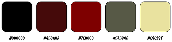
We chose a muted black, red, and olive gradient for the game to represent the very real, sometimes uncomfortable themes of the game.
This dark palette helps create a tense and unsettling atmosphere, reinforcing the seriousness of the player’s experience. The black conveys fear and finality, while the red introduces a feeling of danger, representing the destructive consequences of drunk driving. The olive tone adds a worn, uneasy quality that pulls together the visuals and keeps them from being overly dramatic. Together, these colors support the game’s haunting tone and emphasize the harsh reality at the center of its message.
Typography


Color Palette
Demo Video
Watch a playthrough of Final Destination.
Iterations
3 Major Improvements.
1. Driving Simulator


This iteration moved the driving screen from a basic wireframe into something that felt much more aligned with the tone of the game. In the updated design, we shifted to a darker first-person perspective with more realistic visual styling and lower visibility. This made the experience feel more tense, immersive, and uncomfortable in the way we intended.
2. Decision Screen


This iteration changed the choice screen from a simple one-way decision into something more structured and narrative-driven. In the earlier version, the player only saw a crossed out option, which made the forced choice feel abrupt and confusing. In the updated version, we added additional feedback text for locked alternative path to make the decision feel more intentional. This helped frame the moment more like part of the story, while also reinforcing that safer choices are something the player has to work toward and consciously unlock.
3. Inventory


Originally, we imagined this screen as a garden representing the player's relationship with different aspects of their life including family, friends, career, and academics. While that concept had emotional significance, it felt too detached from the rest of the game and a little unclear in practice. In this iteration, we shifted away from the literal garden and turned the screen into an inventory system of buffs/debuffs that still carries the same underlying idea of cause and effect. This made the feature feel more integrated with gameplay, while allowing us to communicate the consequences and rewards of certain player actions.
Discover More
Husky ButterWalk
A late-night ride safety app partnering with UWPD to make campus safer for students.

BalanceBites
A nutrition app supporting students to make healthy food choices.
