
BalanceBites
Estimated 4 minute read
Timeline
June 2025 - Present
My Role
UI/UX Design
Team
Connor Lam (Project Manager)
Gavin Wan (Research & Writing)
Jenny Zhang (Design)
Me! (Design)
Overview
BalanceBites is a mobile nutrition app prototype designed to help college students find meals, track nutrition and understand their dietary habits in a simple, guided way.
Problem
Newly independent college students struggle to maintain healthy eating habits.
Upon entering college, students often find themselves navigating their own time and eating habits for the first time. Without the support of home-cooked meals by parents and predetermined school lunches, the wide range of food options can feel overwhelming. On top of that, demanding academic, social, and work schedules can make it difficult to prioritize eating proper meals, often resulting in convenient yet nutritionally lacking choices, as is reflected in the common trope of the "college ramen diet."
Solution
Easy-to-use mobile app offering guidance, tracking, & education.
BalanceBites addresses these challenges by providing college students with an easy-to-use mobile app that supports healthier eating through guidance, tracking, and education. The app helps students discover nearby meal options that fit their dietary needs and busy schedules, log meals with minimal effort, and visualize their nutritional intake through clear progress dashboards. By combining personalized recommendations with simple explanations of nutrients, BalanceBites empowers students to make more informed food choices without requiring extensive planning or prior nutrition knowledge.
Competitive Analysis
Existing solutions require too much time or money & are not tailored to students.
Our competitive analysis examined three nutrition-related solutions: NUTR 200, Noom, and HelloFresh. UW offers a NUTR 200 course which provides broad nutritional education but lacks daily, specific guidance for students. Noom provides personalized coaching, tracking tools, and lessons, though its weight-loss focus make it less accessible to college students with varied goals and all programs cost money. HelloFresh simplifies meal prep and offers convenient, fresh ingredients, but it is expensive and does not teach users how to build long-term nutritional habits. Taken together, these competitors highlight a gap: existing solutions either require too much time and money, or do not offer practical, everyday nutrition support tailored to students.
User Research
Surveys confirmed that students struggle with maintaining healthy eating habits.
Our user research was conducted through a survey targeting UW students, particularly freshmen. Responses showed that many students struggle with inconsistent meal schedules, low energy, and limited nutrition knowledge, despite wanting to eat better. Time, budget, and lack of guidance were the most common barriers. Overall, the survey results supported the need for a simple tool that helps students improve their eating habits.
Visual Design
Simplicity & Clarity.
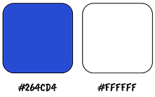
We chose a bright blue and pure white for our central color palette.
These colors reflect the simplicity and clarity of our app. The signature bright blue was chosen to complement our mascot, "BlueBerry", whose name shares the same double "B" as BalanceBites. Using the same blue and repeating the “B” theme throughout the design, we created a cohesive and playful brand identity.
Typography


Color Palette
Mascot

Iterations
After the course ended, I continued to redesign the app; below are my favorite changes.
1. Start


In the initial iteration, the start screen featured a muted color palette and a low-contrast “Start” button, which made the entry point feel less engaging.
In the revised design, I strengthened visual hierarchy by increasing contrast and introducing a more prominent bright-blue brand color. The updated screen also incorporates a friendly mascot element to create a more inviting first impression for users.
2. User Information


The original onboarding screens separated information across multiple pages and used identical button styles, making the process feel longer and less intuitive.
In the updated design, all inputs are displayed on one screen with clear color-coding and placement, supplemented by guidance from our mascot.
3. Home Page
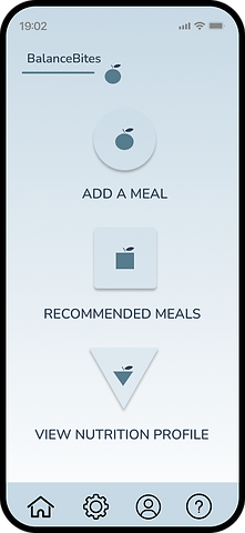

Our first home page layout featured small icons and lengthy text, which made it hard for users to immediately understand where to go or what the app offered.
In the new design, we replaced these elements with large, clear buttons for “Find a Meal” and “View Progress,” making the primary tasks stand out at a glance. I also introduced supporting help buttons featuring our mascot to assist any remaining confused users.. Finally, I visually refined the navigation bar to match the updated style of the app and added labels to further improve clarity.
4. Log a Meal


Our original screen featured a confusing, open-ended interface which prompted the user to vaguely enter a message describing their meal. A feature for entering nutrition facts was discreetly hidden in a button at the top, and the corresponding screen required a tedious process of entering numbers.
I began by consolidating the feature into one screen, which begins by prompting for a meal type. It then asks for a name, which is then run through a search algorithm to automatically find the corresponding nutrients, removing tedious entry. Finally, a loading screen was added to emphasize how the app analyzes each meal.
Discover More
Husky ButterWalk
A late-night ride safety app partnering with UWPD to make campus safer for students.

Final Destination
An immersive drunk driving awareness video game.
